Certain brands are directly identifiable by their color. Coca-Cola red, Chanel black and gold or IKEA yellow allow them to be immediately identified.
The color a company uses to be identified also has significance. A brand can thus express the confidence that one can have in it, the quality of its products and much more.
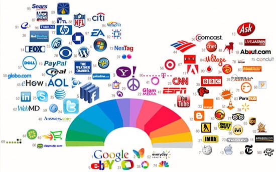
Here is a color guide based on research by Karen Haller, expert in colors and their influence on your business. Let's see how different colors can cause some manipulation of your customers.
Yellow: fun and friendship
Yellow means ...
The brands using yellow want to express joy, optimism and friendship. Yellow is also the most visible color in daylight. Difficult to pass in a street and to ignore a sign to this color.
Brand using yellow
IKEA uses yellow in its logo, leaflets, ... even in its store. This means for the consumer that it is fun. Do not you go to IKEA with your family? I doubt your children will be bored.
Other major brands using yellow: Renault, Mc Donald, Amazon.com
Red: power and passion
Red means ...
Red is the color of power, power and passion. It also represents energy, courage and sensation.
Brand using red
Virgin used red since its inception. Richard Branson, its founder, wanted it to express the feeling of confidence and energy. A real success.
Other major brands using red: Ferrari, Kellogg's, Coca-Cola
Purple: luxury and fantasy
Purple means ...
Quality, luxury and decadence are associated with purple. Attention, it can sometimes seem too fanciful and not enough in touch with reality.
Brand using purple
Milka is the most famous of purple cows. The consumer feels the quality through this color.
Other major brands using the purple: Yahoo, Hallmark, Barbie

Black: prestige and exclusivity
Black means ...
Like the purple, black is a color of luxury. When properly used, black communicates prestige and exclusivity. Black is a color to which you will more easily grant your 'serious'.
Brand using black
Chanel's walleye and black make you think of products of unparalleled quality and exclusivity.
Other major brands using black: Yves-Saint-Laurent, Puma, Waterman
Orange: mischievous and cheerful
The orange means ...
The orange is gaiety. Companies using orange are perceived as joyful, fun and emphasizing social contact. The orange also represents physical comfort, like the sun and its warmth. But be careful when using orange, a brand can be judged incapable of being serious.
Brand using orange
The bank and insurance ING uses the orange in its logo, the lion. She expresses this 'ludic' aspect and compensates for it by the blue of ING, which brings its confidence and logic. We can not imagine a bank wanting to put the "fun" aspect forward.
Other major brands using orange: Fanta, Harley Davidson, Firefox
Brown: heat and reliability
Brown means ...
Thinking 'brown', chocolate comes to mind immediately. But behind this color, you also feel warmth, security and reliability.
Brand using brown
UPS is perceived by its customers as a trusted delivery company. Brown is the perfect choice for a brand wanting to express that we should give it our confidence.
Green: youth and nature
Green means ...
Green is a color now widely used for everything concerning the environment and its protection. Green means youth and love of life.
Brand using green
Garnier is clearly showing its desire to help its customers protect nature. The company is directly involved in this process. Its Fructis Garnier shampoo is sold in eco-packaging.
Other major brands using Green: BP, Land Rover, Greenpeace
Blue: calm and logical
Blue means ...
Blue represents trust, integrity and communication. Caution, misused, blue can also make your brand appear cold, distant and inaccessible. I experimented on Targuzo, before bringing an orange key ;-). Your customers associate blue with logic, calm and serenity
Brand using blue
The big social networks on the Internet like Facebook, Twitter and Linkedin, use blue as a priority in their logo. The bright blue of Twitter, tending towards the yellow, also expresses the entertaining aspect of this social media.
Other brands using blue: Dell, Oral-B, American Express

No comments:
Post a Comment